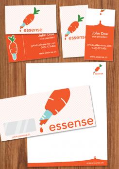
Stationery design.
Think BOLD :D
Logo und Design für Catering Company
- Wettbewerb von: mvirmond
- Kategorie: Logo & Corp. Design
- Status: Beendet
Startdatum: 02-10-2012
Enddatum: 12-10-2012
Alles begann mit einer Idee …
Ein kurzer, interaktiver Leitfaden half ihnen, ihren Designstil zu entdecken und erfasste genau, was sie brauchten.
Brandsupply ist eine Plattform, auf der kreative Fachleute und Unternehmen gemeinsam an einzigartigen Projekten und Designs arbeiten.
Kunden, die zum Beispiel ein neues Logo oder eine Markenidentität suchen, beschreiben ihre Anforderungen. Designer können anschließend über Brandsupply am Projekt teilnehmen, indem sie ein oder mehrere Designs einreichen. Am Ende wählt der Kunde das Design aus, das ihm am besten gefällt.
Die Kosten variieren je nach Projekttyp – von 169 € für einen Firmen- oder Projektnamen bis zu 539 € für eine vollständige Website. Der Kunde entscheidet selbst, wie viel er für das gesamte Projekt bezahlen möchte.
Keine Kommentare
I like it!
i like it too - it's fun
i need to think about it for a bit though
If you'd like I could whip up some templates(business cards and what have you)
I'd be happy to look at them. This design is still a bit out there - very different from all the other designs. For me, it hasn't made the final selection (yet), but it's pretty close. Feel free to play around with the logo and come up with the templates if you don't mind. I imagine that could bring it to life even more
Hey there.
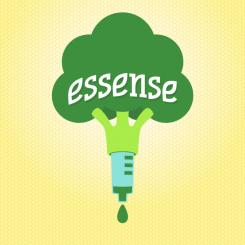
I thought about your comments and your new input on the whole competition and I give you these two top of the line, all natural, farm fresh, custom logos.
Enjoy!
Again, feedback will be much appreciated.
fun as well, but i'm not sure people get it as quickly as the carrot-version
Hey there!
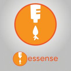
I particularly enjoyed the witty name, so I made this design.
Being that you serve salads, healthy food and such and your name is in fact "essence", so why not make a clever/witty logo?
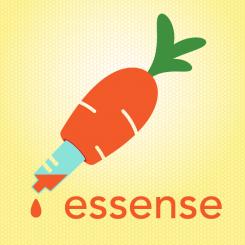
The simplified image of a pipette dripping a droplet of fresh food should do the trick.
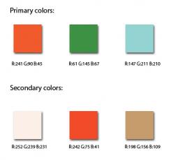
The colors were specifically chosen to work up an appetite, usually companies dealing with food use warm colors in their branding(think McDonald's, Burger King, Pizza Hut etc.)
The logo is circular, as in it is whole, complete and friendly at the same time.
Because of the logo's simplicity it can be used in a myriad of ways: from embroidered hats to mugs, pens, calling cards, you name it. Basically, a brand can easily be built around it.
I hope you like it, feedback will be much appreciated.
thanks for the design and extensive explanation!
Not a bad idea at all. i like the colors - less obvious than green, but exactly as you say, still fresh and appetizing. to be frank, I didn't immediately recognize the symbols. I saw an upside down carrot, and some tool or the letter E on top. maybe you can play around with the idea a bit?
 Nederland
 België
 France
 Österreich
 United Kingdom
 International
